My client came to me with one goal, create a prestigious and simplistic logo. A design that represents his likes, and how he will run his business. J.coles Car Detailing is a car detailing business, that focuses on the best professional quality.
We struggled at first, the bottom rough designs he liked but it was still too detailed for him. The car had too much to it, which wasn't his style of choice. I had to think about incorporating in an illustration that had a lot less linework but still make it pop. These kinds of styles is something I've explored more recently, doing a lot more logos that aren't tailored towards the creative arts industry where they tend to be a lot more off beat. Was definitely a learning curve!
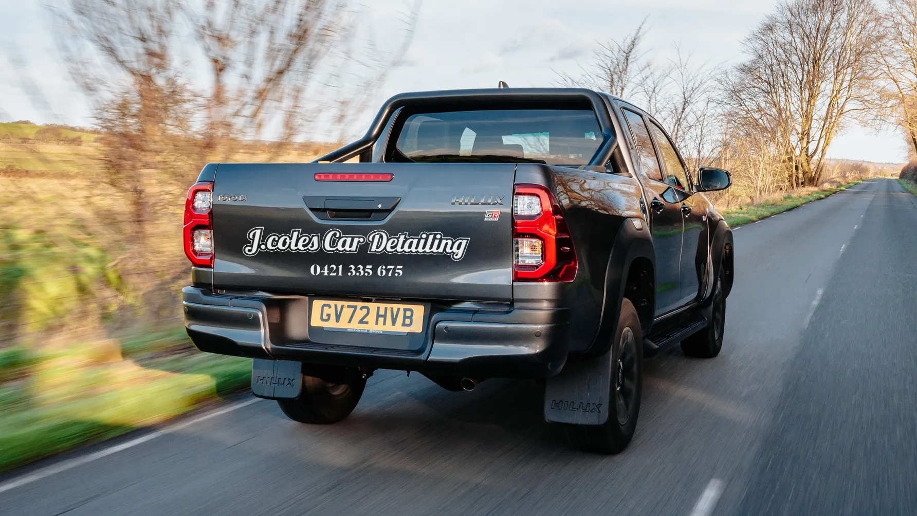
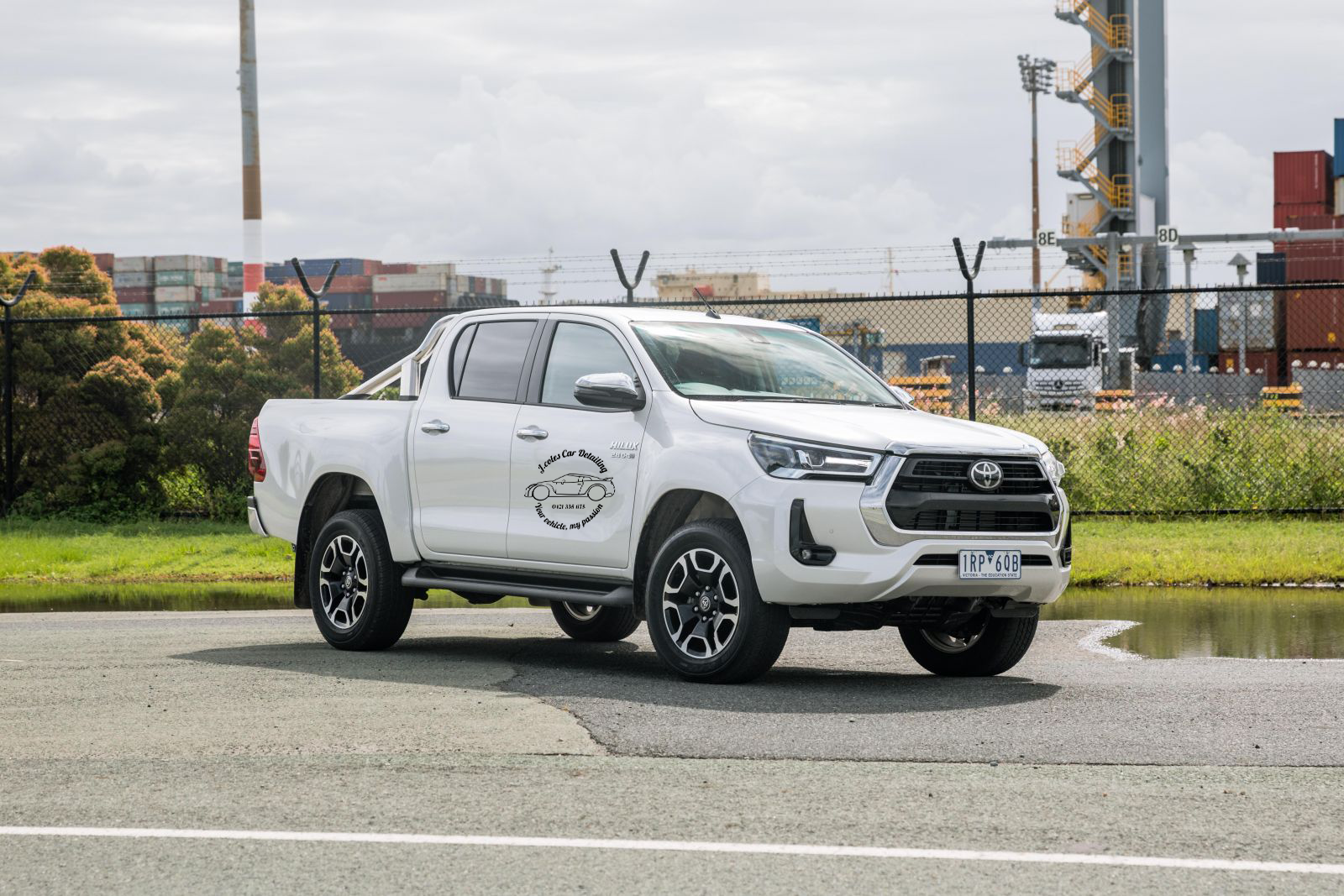
I decided on creating an emblem as a logo, the car being the most captivating. I believe when people randomly see this sticker on his car as an example they will look directly at that. I purposely went with the same font for the company's name and slogan, because it visually made sense with the circular motion. Client really liked script writing for the choice of font, after trial and error he was over the moon with the choice since it was easy to read and the final result!
The result of a simplistic logo enhances my clients ability to have potential customers contact him. Easily readable and reachable gave my client the opportunity to add to his business.
KEYWORDS
simple, prestigious, clean


